What makes a series feel noir?
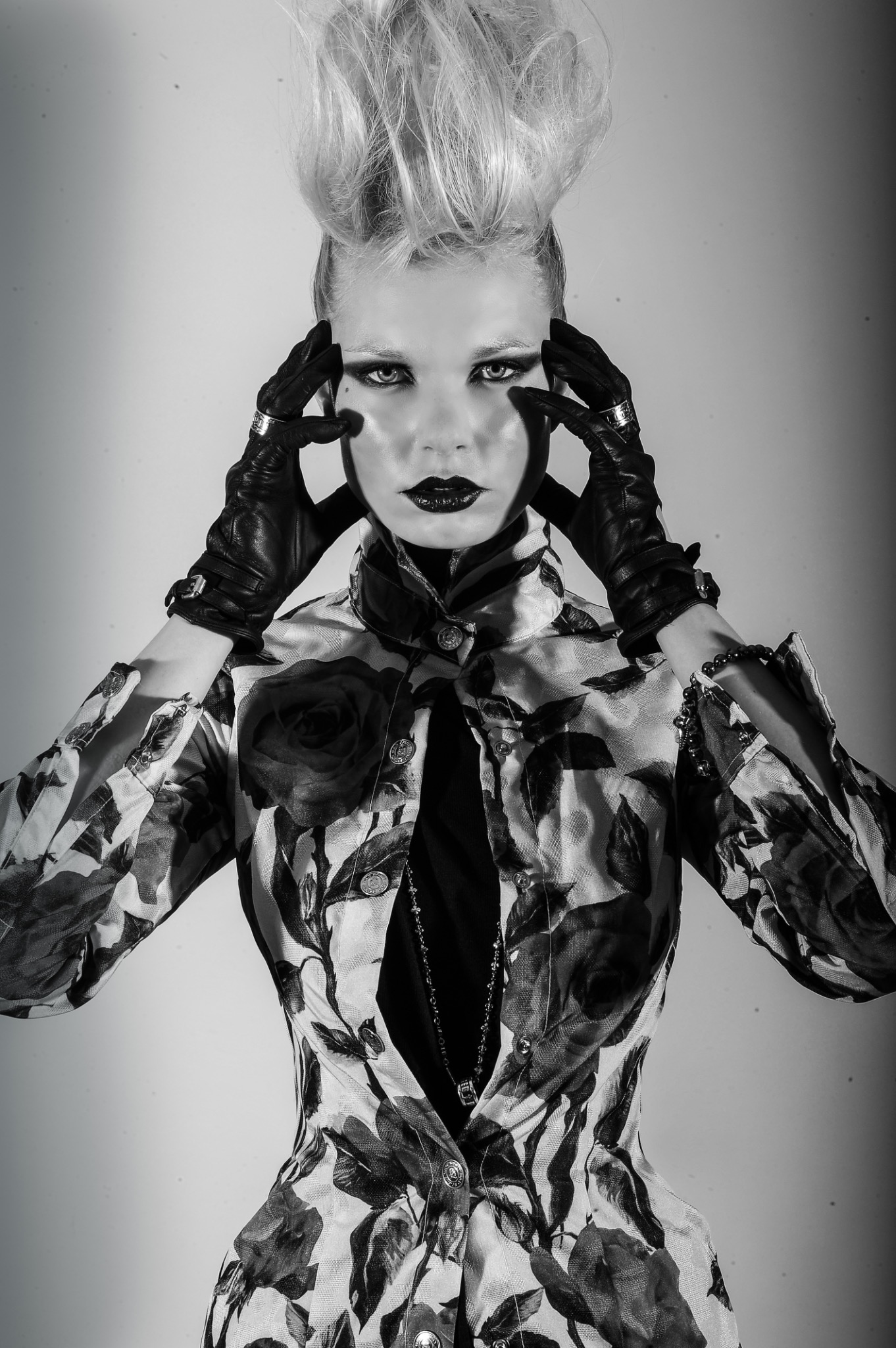
Shadow can conceal part of a scene or direct attention towards a face. A restrained palette can make a small colour change meaningful. Stillness, ambiguity and an intentional use of negative space can create tension without elaborate production.
These are creative possibilities, not a requirement to make every image darker. A photograph can feel atmospheric while preserving clear detail, readable skin tones and a deliberate point of focus.
Muted colour with a purpose
Think about the relationship between the colours across your sequence. A cool setting and a warmer subject might create distance; a narrowly controlled palette might make fabric, gesture or light more prominent. Keep the treatment consistent enough that the photographs read as one story.
Do not submit colour work simply because it has a dark filter. Ask what the lighting and palette add to the idea, and whether the styling, expression and setting support that intention.
Prepare your selection
Review the full sequence at a similar viewing size. Check that shadows have not hidden essential details and that the most dramatic frame does not leave the rest of the story feeling disconnected. Include a range of compositions that develops the same idea.
If your series combines monochrome and colour, give each treatment a reason. For our main editorial direction, read black-and-white photography submissions.
Submit a story that belongs in ARTNOIR
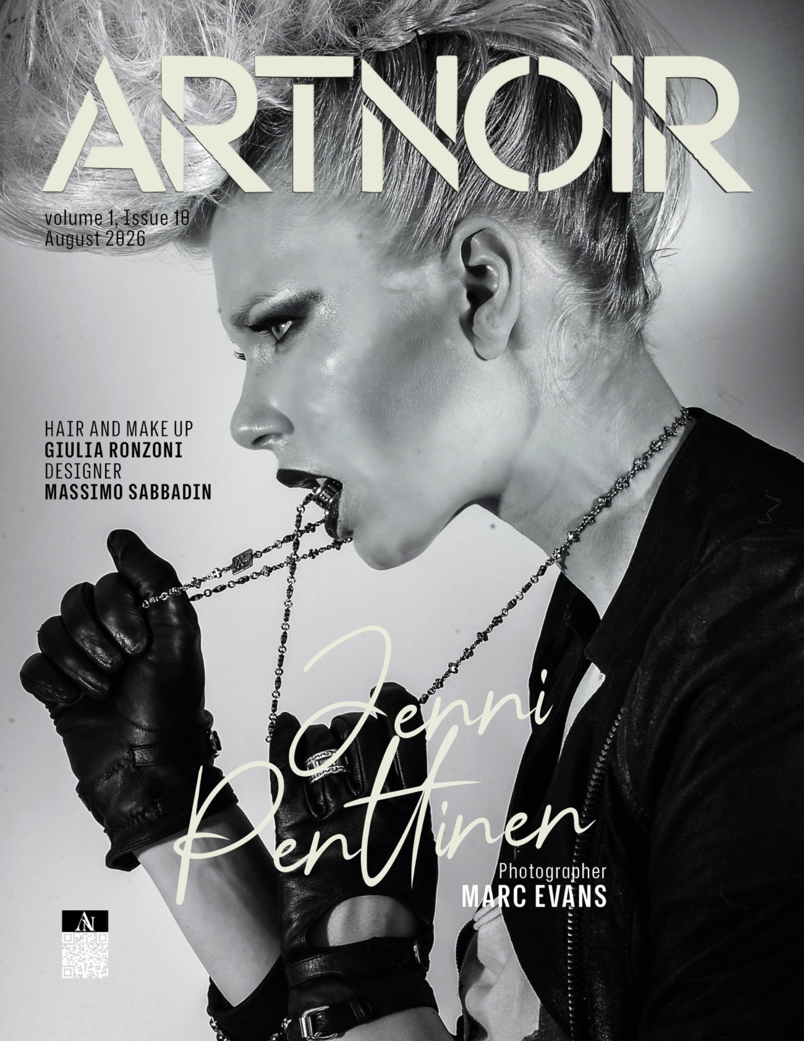
We consider fashion, beauty, portrait and fine-art stories within this atmosphere. Explore our editorial example, then use the submission checklist to prepare your work. The active Kavyar call sets the final requirements, options and timing.
Show us your noir.
Explore the current calls, requirements and options on ARTNOIR’s Kavyar page.
View ARTNOIR calls on Kavyar